I have always wanted to learn R Shiny, but kept postponing it. Finally, I got a chance to go through some tutorials on Shiny’s web page. It is actually pretty easy to get started if you have basic programming knowledge in R. So, I built this simple app to do a model fitting with gradient boosting while adjusting the parameters in real time. Lets get started then.
RShiny
The shiny library in R is an easy way to interactively visualize your data analysis. Essentially, one could create a web application (that can be hosted too) and view it on a web browser with minimal or no HTML/CSS/Javascript knowledge requirement. Yes, thats the beauty of shiny, it internally creates the user interface (UI) using these web technologies, while you just need to program in R.
The Shiny framework has primarily two components - the UI component and the server component. In the UI component, we program the front-end where we design input elements like text boxes, sliders, dropdown menus, etc. Once we get the input from the user, we can pass it to the server component to do some processing and then display an output. The output can be rendered in the form of plots, datatables, images, text, etc. In the hands-on section, I will explain what are the inputs and outputs in this application.
Gradient Boosting
Boosting is an ensemble machine learning technique which combines the predictions from many weak learners. A weak learner is a predictor whose accuracy is just better than chance. An example would be a decision tree with 1 split - not a strong classifier, but better than flipping a coin to make a prediction. When we combine many such trees by a weighted average of their predictions we end up with a strong classifier. In boosting, the way we decide on individual trees is a process called forward stagewise additive modelling. The trees are learnt sequentially in boosting, with the early learners fitting fairly simple models. As the iteration progresses, the new learners become more complex focusing on the training examples where the previous learners made a mistake or error. At the end of the iteration process, the individual learners are given weights and the final prediction is a linear combination of these individual predictions. The most common weak learners used are decision trees. Check out this video to get a better understanding.
There are multiple parameters that can be altered while fitting a boosting model. The parameters that I have chosen for my app are the following:
- Number of trees: Equivalent to the number of iterations as explained above.
- Interaction Depth: The depth to which each tree should be grown. Depth = 1 implies one split, i.e., 2 nodes.
- Bagging Fraction: In each iteration, we can use a subset of the training data for fitting the weak learner. Setting a bagging fraction of 0.8 means, randomly sample (without replacement) 80% of the training data for each tree in the sequence.
- Shrinkage: This is a kind of regularization parameter, a lower value such as 0.001 implies that we take smaller steps between iterations, penalizing any sudden changes in the model (aiding a slow learning process). Though a lower value can improve the generalizability of the model (due to less over-fitting), it comes at a cost of more computational time.
Hands-On
Now that we have a background of the software and the algorithm, lets put it together to design the application. On the UI side, we define panels on which we place the following input elements: 2 sliders and 2 dropdowns. These are the elements with the help of which the user can provide/modify an input. We also need an element to display the output, which is a graph in our case and therefore we define a plot element. The arguments for the input or output elements are pretty straightforward and intuitive. The name that you give for the argument ‘inputId’ or ‘outputId’ is the one that would be used to access the element on the server side.
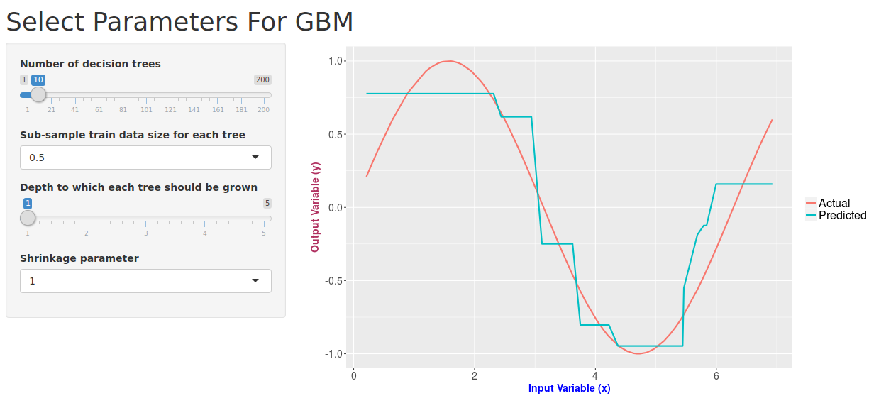
library("shiny")
library("gbm")
library("ggplot2")

ui <- pageWithSidebar(
  headerPanel('Select Parameters For GBM'),
  sidebarPanel(
    sliderInput(inputId = "numTrees", label = "Number of decision trees", min = 1, max = 200, value = 10),
    selectInput(inputId = "bagFrac", label = "Sub-sample train data size for each tree", choices = list(0.5,0.6,0.7,0.8,0.9,"1.0" = 1.0)),
    sliderInput(inputId = "depth", label = "Depth to which each tree should be grown", min = 1, max = 5, value = 1),
    selectInput(inputId = "shrinkage", label = "Shrinkage parameter", choices = list(1,0.1,0.01,0.001))
  ),
  mainPanel(
    plotOutput(outputId = "predictionPlot")
  )
)
Now that we have our UI ready, lets move on to the server function. For the ‘predictionPlot’ element defined on UI side, we need to tell shiny to calculate the values and plot the graph. All of that code needs to go into the render function. In this case, I am defining the input variable x as a random uniform distribution and the target variable as sin(x). Then I fit a regression model using gradient boosting, and I make use of all of our inputs in this function (numTrees, bagFrac, depth, shrinkage). Once we have the model, we can go on to predict (Here, I am making the predictions on the training data itself). And the final part is to make a plot between the true values vs the predicted values of the target variable y. I have done this using the famous plotting library in R - ggplot2.
server <- function(input, output){

  output$predictionPlot <- renderPlot({
    # Creating the data
    set.seed(100)
    x <- runif(100, min = 0, max = 7)
    x <- sort(x, decreasing = F)
    df <- data.frame(x = x,y = sin(x))

    # Fitting the model
    fit <- gbm(y~x, data=df, distribution="gaussian", n.trees = input$numTrees, shrinkage = as.numeric(input$shrinkage), interaction.depth = input$depth, bag.fraction = as.numeric(input$bagFrac))
    # Make predictions on the train data itself
    predictions <- predict(fit, df, n.trees = input$numTrees)
    df$pred <- predictions

    # Plotting Actual vs Predicted
    ggplot(df, aes(x)) +
      geom_line(aes(y = y, colour = "Actual"), size=1) +
      geom_line(aes(y = pred, colour = "Predicted"), size=1) +
      xlab("Input Variable (x)") + ylab("Output Variable (y)") +
      theme(
        axis.title.x = element_text(color="blue", size=14, face="bold"),
        axis.title.y = element_text(color="maroon", size=14, face="bold"),
        axis.text.x = element_text(size=14),
        axis.text.y = element_text(size=14),
        legend.text = element_text(size = 16),
        legend.position = "right",
        legend.title = element_blank()
      )

  }, height = 500, width = 800)

}

shinyApp(ui = ui, server = server)
So if you have done all the coding part correctly, this is how the application should look like:
That was pretty simple, right? A beautiful application, up and running in almost no time. The other cool thing is that shiny allows you to publish and share your app with others for free. You just need to sign up on their website. And, this app of mine can be found on here.
This was my first attempt with shiny, writing an application with just about 50 lines of code. I am a huge fan of data visualization softwares and will surely try out more apps. And when I do, I ll share my learning here on this blog.