In Part I of this tutorial, the data pertaining to data science jobs was crawled from naukri.com. The job postings had several attributes including location, salary, skills required, education qualifications, etc. to name a few. In this post, I make use of this data to gain some insights about the jobs in this sector in India.
We had saved the data after scaping as a pickle object (cPickle library). Lets start by retrieving this data into our workspace. If you don’t have the file from Part I, you can download the data from my github repository and start.
import pandas as pd
from pandas import DataFrame
import cPickle as pickle

with open('naukri_dataframe.pkl', 'r') as f:
    naukri_df = pickle.load(f)
The dataframe has a structure as below:
We can first analyze the location column. The question is - which city in India has the most data science job openings? The pandas dataframe function value_counts() can be used to get the number of jobs per city.
naukri_df['Location'].value_counts()[:10]
Bengaluru              626
Mumbai                 190
Hyderabad              143
Pune                    86
Delhi NCR               57
Chennai                 55
Gurgaon                 55
Delhi NCR,  Gurgaon     44
Delhi                   32
Noida                   29
Name: Location, dtype: int64
As you would have already noticed from above, we need to group some places into a single category. For example, ‘Delhi’, ‘Noida’, ‘Gurgaon’ into one category ‘Delhi NCR’. The other issue that I encountered is that there are some rows with locations mentioned as comma separated values. For example:
print naukri_df.ix[499,'Location']
Delhi NCR, Mumbai, Bengaluru, United States (U.S), Singapore, Hong Kong, Chicago
To handle the second issue, I split such comma separated location values and determine a list of unique possible job locations. Then, a string is created by concatenating all the records of ‘Location’ column. Finally, pattern matching is used to count the occurence of each unique city/location in this string.
import re
from collections import defaultdict

# Find unique locations
uniq_locs = set()
for loc in naukri_df['Location']:
    uniq_locs = uniq_locs.union(set(loc.split(',')))

uniq_locs = set([item.strip() for item in uniq_locs])

# All locations into a single string for pattern matching
locations_str = '|'.join(naukri_df['Location'])
loc_dict = defaultdict(int)
for loc in uniq_locs:
    loc_dict[loc] = len(re.findall(loc, locations_str))

# Take the top 10 most frequent job locations
jobs_by_loc = pd.Series(loc_dict).sort_values(ascending = False)[:10]
print jobs_by_loc
Bengaluru                756
Mumbai                   285
Delhi                    200
Hyderabad                182
Delhi NCR                148
Gurgaon                  128
Pune                     121
Chennai                   73
Noida                     43
Bengaluru / Bangalore     23
As can be seen, Bangalore has a lion’s share of all machine learning jobs. That was expected, right? Bangalore being the major IT hub of India. Now lets come back to the first issue. We need to combine Gurgaon, Noida and Delhi to Delhi NCR and also keep Bengaluru / Bangalore along with Bengaluru. I had to do this manually.
jobs_by_loc['Bengaluru'] = jobs_by_loc['Bengaluru'] + jobs_by_loc['Bengaluru / Bangalore']
jobs_by_loc['Delhi NCR'] = jobs_by_loc['Delhi NCR'] + jobs_by_loc['Delhi'] + jobs_by_loc['Noida'] + jobs_by_loc['Gurgaon']
jobs_by_loc.drop(['Bengaluru / Bangalore','Delhi','Noida','Gurgaon'], inplace=True)
jobs_by_loc.sort_values(ascending = False, inplace=True)
print jobs_by_loc
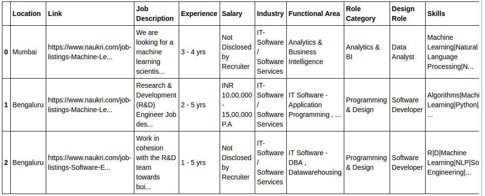
Bengaluru    779
Delhi NCR    519
Mumbai       285
Hyderabad    182
Pune         121
Chennai       73
So thats how the stats look after we combine and group cities. Now Delhi NCR is not that far behind!
Putting these values into charts make it easier to do the comparison. For data visualization, I have used seaborn and matplotlib. Seaborn is an amazing data visualization tool, I highly recommend that you check it out.
import seaborn as sns
import matplotlib.pyplot as plt
%matplotlib inline
sns.set_style("darkgrid")
bar_plot = sns.barplot(y=jobs_by_loc.index,x=jobs_by_loc.values,
                        palette="muted",orient = 'h')
plt.title("Machine Learning Jobs by Location")
plt.show()
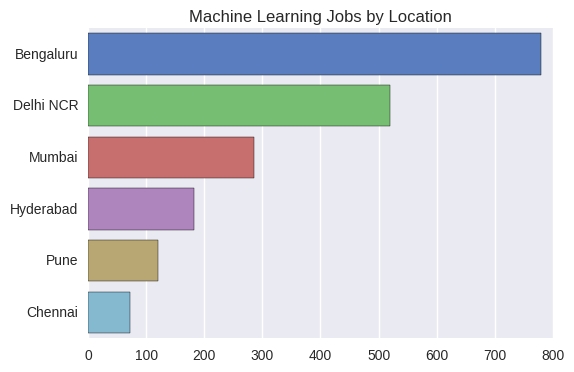
Next let us look at the companies who do maximum hiring in this sector. As seen from the plot below, the top blue chip companies companies like Microsoft, Amazon and GE are among the top recruiters. Some recruiters wish to stay confidential and some others do hiring through consultants like Premium-Jobs.
jobs_by_companies = naukri_df['Company Name'].value_counts()[:10]
bar_plot = sns.barplot(y=jobs_by_companies.index,x=jobs_by_companies.values,
                        palette="YlGnBu",orient = 'h')
plt.title("Machine Learning Jobs by Companies")
plt.show()
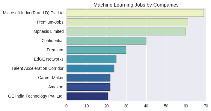
We have a column for salary and one for experience. What can we make of this? Well, we can see how correlated salary with experience. Lets do this through a scatter plot. However, only a small percentage of the recruiters have explicitly provided the salary. I have made use of only those records which give the salary range. I carried out some string operations in Python to clean the data. For example, a record may have a salary range of INR 5,00,000-9,00,000 and experience range of 3-5 years. For plotting purposes, we need a single value and not a range. So, I calculate the mean value, which are INR 7,00,000 and 4 years respectively, in the above example.
salary_list = []
exp_list = []
for i in range(len(naukri_df['Salary'])):
    salary = naukri_df.ix[i, 'Salary']
    exp = naukri_df.ix[i, 'Experience']
    if 'INR' in salary:
        salary_list.append((int(re.sub(',','',salary.split("-")[0].split("  ")[1])) + int(re.sub(',','',salary.split("-")[1].split(" ")[1])))/2.0)
        exp_list.append((int(exp.split("-")[0]) + int(exp.split("-")[1].split(" ")[1]))/2.0)
    i+=1

plot_data = pd.DataFrame({'Experience':exp_list,'Salary':salary_list})

sns.jointplot(x = 'Experience', y = 'Salary', data=plot_data, kind='reg', color='maroon')
plt.ylim((0,6000000))
plt.xlim((0,16))
plt.show()
As evident, the salary offered increases with experience. The pearson correlation coefficient is 0.65. Candidates with over 12 years are even offered more than INR 30,00,000 per annum, which is pretty interesting. The graph also depicts the histograms of both salary and experience. Both of these variables have distributions which are skewed towards the lower range of values.
Moving on to the educational qualifications required for this job. We have 3 columns at our disposal - UG, PG and Doctorate. I will just be focusing on the column ‘Doctorate’, which mentions if a PhD is necessay for the job, if yes, any particular specialization that is preferred. I have made use of Python’s nltk to tokenize sentences into words.
import nltk
from nltk.tokenize import word_tokenize

from collections import Counter

tokens = [word_tokenize(item) for item in naukri_df['Doctorate'] if 'Ph.D' in item]
jobs_by_phd = pd.Series(Counter([item for sublist in tokens for item in sublist if len(item) > 4])).sort_values(ascending = False)[:8]
bar_plot = sns.barplot(y=jobs_by_phd.index,x=jobs_by_phd.values,
                        palette="BuGn",orient = 'h')
plt.title("Machine Learning Jobs PhD Specializations")
plt.show()
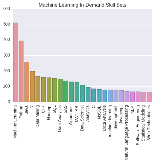
Indeed math and computer science are the two most in demand PhD specializations for a data science role. However, only about 10% of the jobs actually ask for a doctorate degree. So you don’t need to spend 5 years doing a PhD to find a top data scientist job. Then you may ask, what exactly are the technical skills that companies look for when hiring? To answer this question, I make use of the skills column to plot the following bar chart. Machine Learning, Python, R, Java, Hadoop, SQL are some of the skills that can land you a data science job.
skills = pd.Series(Counter('|'.join(naukri_df['Skills']).split('|'))).sort_values(ascending = False)[:25]
sns.color_palette("OrRd", 10)
bar_plot = sns.barplot(y=skills.values,x=skills.index,orient = 'v')
plt.xticks(rotation=90)
plt.title("Machine Learning In-Demand Skill Sets")
plt.show()
And next, we have the last visualization for this post. Moving away from the typical charts and plots, let us do something more exciting. Here, I present to you the wordcloud. A WordCloud is essentially a plot of words present in a document, sized according to their frequency of occurence. I have used the wordcloud library which can be found here. And the document that I feed into this function is a string created by concatenating all the ‘Job Description’ values from our table. You can see for yourself the words that are most frequently used in data science role descriptions.
from wordcloud import WordCloud, STOPWORDS

jd_string = ' '.join(naukri_df['Job Description'])

wordcloud = WordCloud(font_path='/home/hareesh/Github/naukri-web-scraping/Microsoft_Sans_Serif.ttf',
                          stopwords=STOPWORDS,background_color='white', height = 1500, width = 2000).generate(jd_string)

plt.figure(figsize=(10,15))
plt.imshow(wordcloud)
plt.axis('off')
plt.show()

Thats all folks! I hope you have found some of these job market insights useful. All of the data and code can be found on my github repository in the form of an IPython notebook.